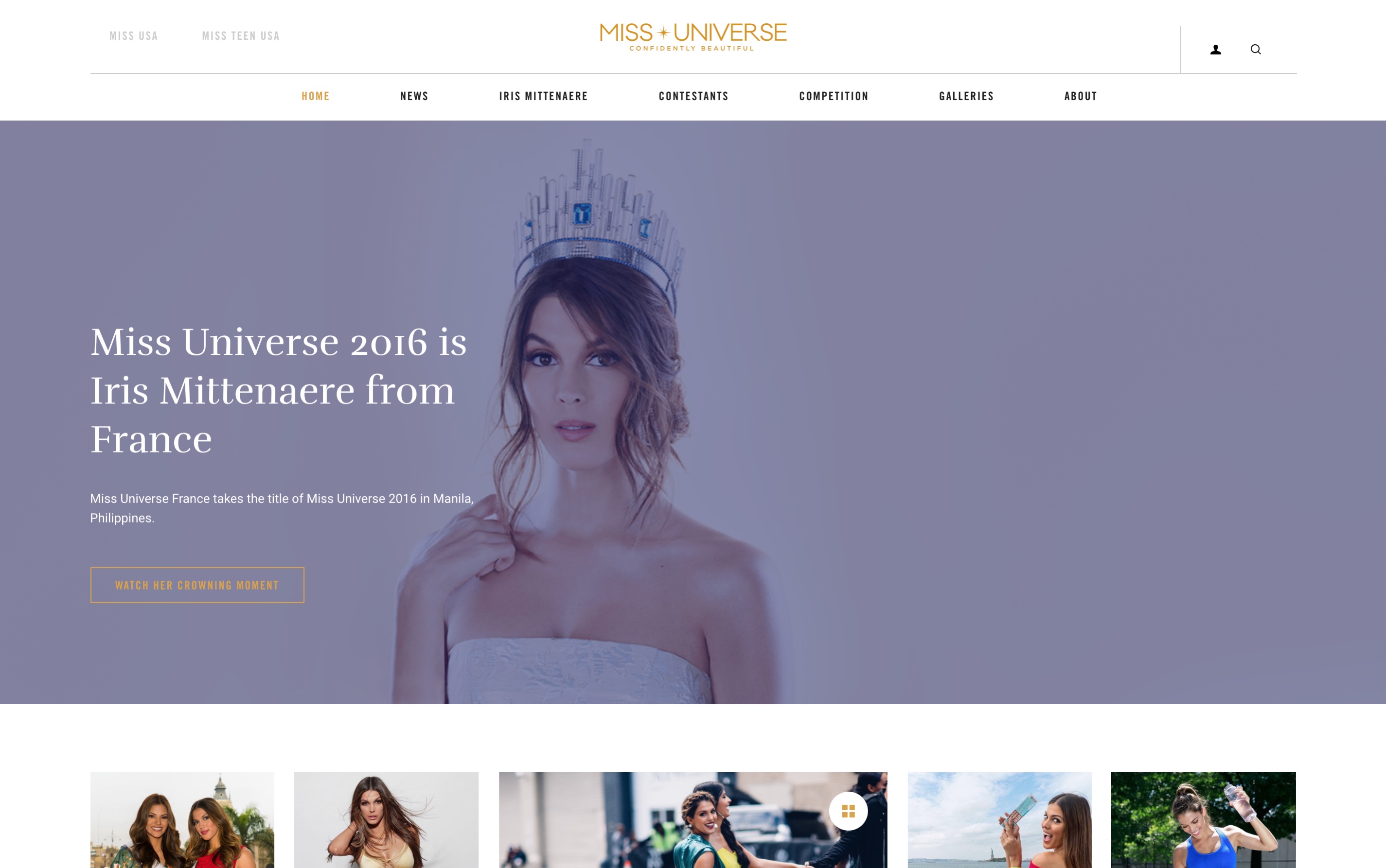
The Miss Universe Organization, represented by IMG entertainment, approached UNIT9 to redesign their main corporate website, which houses three distinct properties — Miss Universe, Miss USA and Miss Teen USA — each with their own audience and content set.
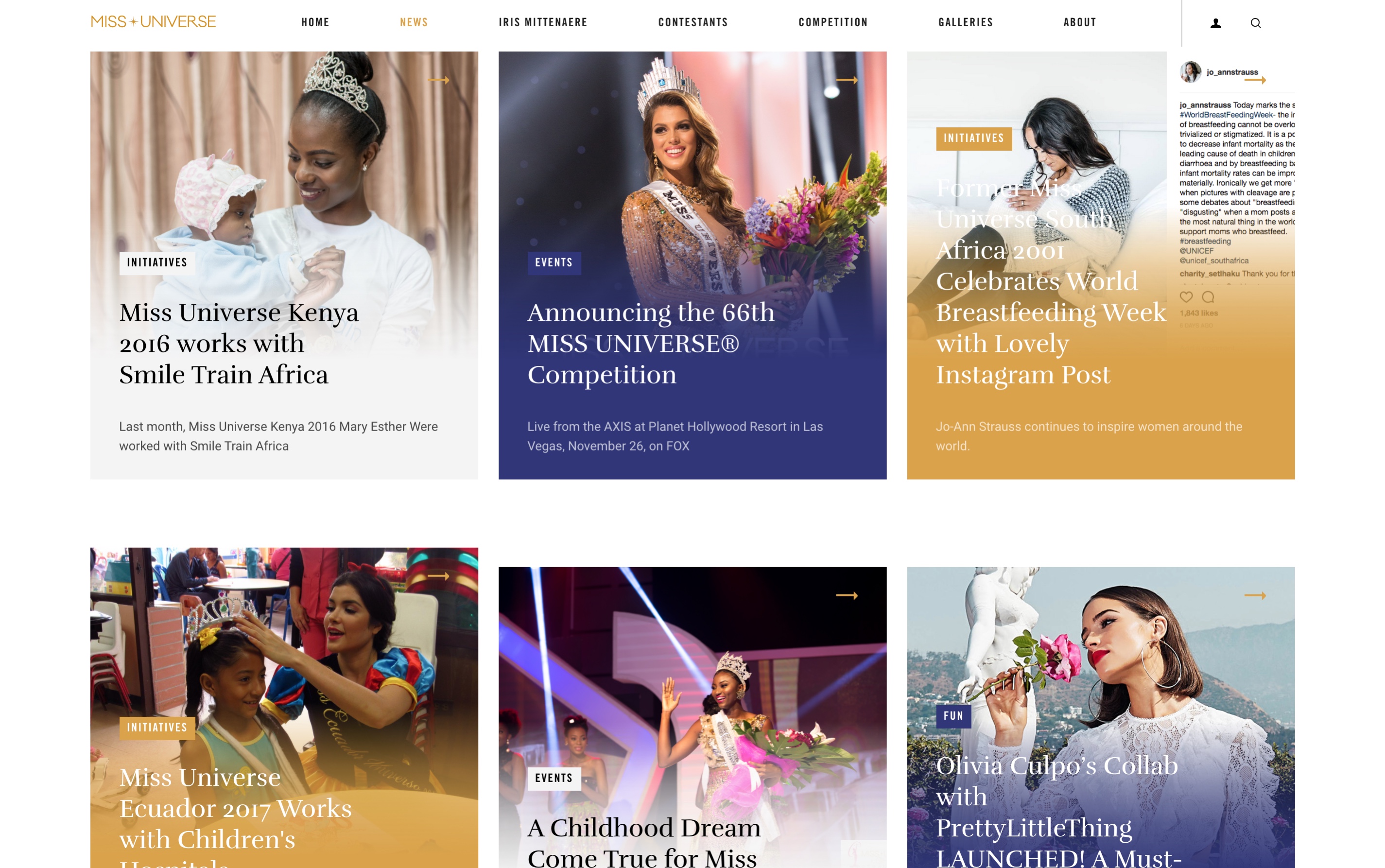
The objectives were twofold: refresh the website’s experience, and put the emphasis on the ‘News’ and ‘Lifestyle’ content produced by the organization.
The Miss Universe Organization, represented by IMG entertainment, approached UNIT9 to redesign their main corporate website, which houses three distinct properties — Miss Universe, Miss USA and Miss Teen USA — each with their own audience and content set.
The objectives were twofold: refresh the website’s experience, and put the emphasis on the ‘News’ and ‘Lifestyle’ content produced by the organization.
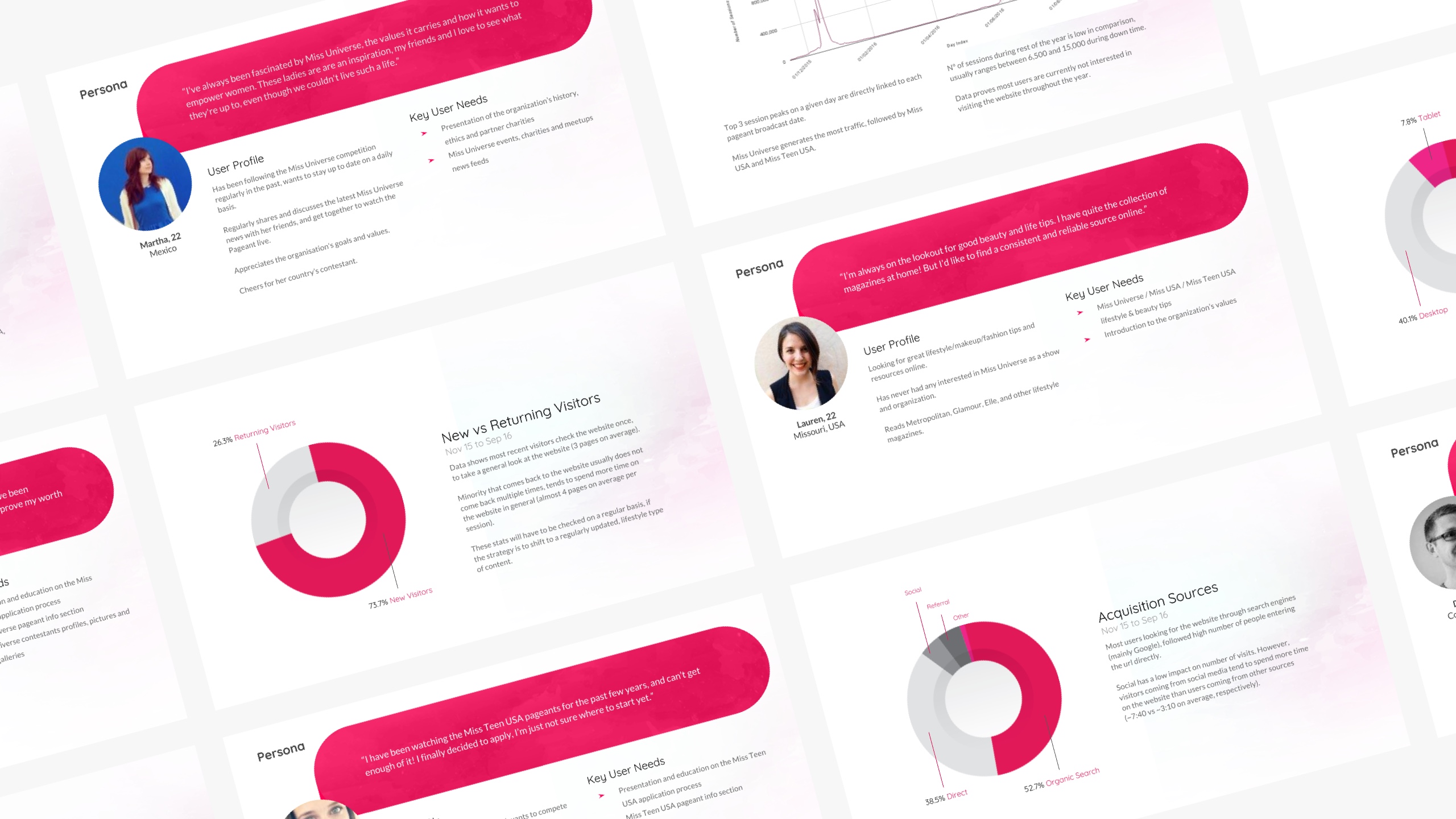
IMG provided us with the previous site's analytics. I thoroughly inspected the data available for the past 12 months, and gathered my findings in a discovery deck. This was then compiled with my creative lead's strategy slides, and the user personas I had identified with the help of the client.
This document proved invaluable during the discovery phase of the project.
Full discovery deck available upon request.
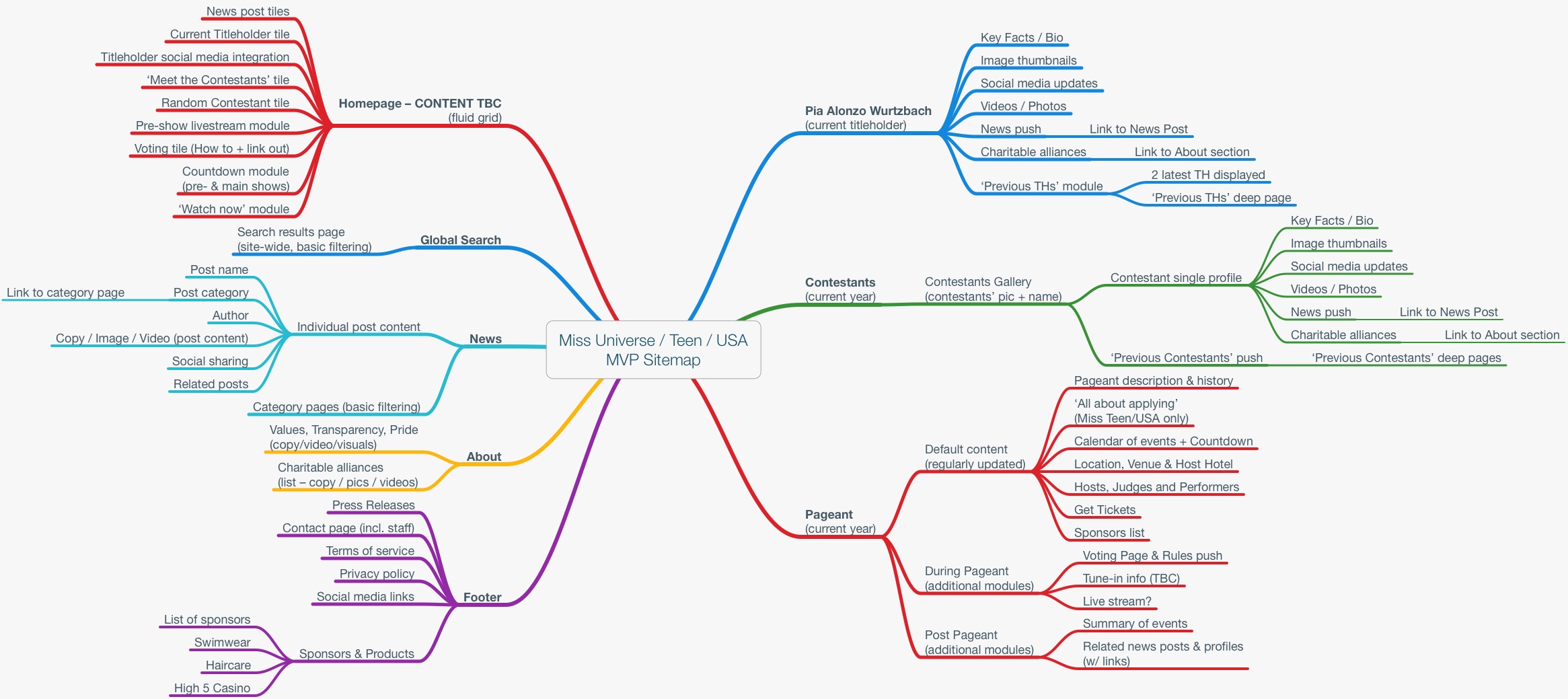
Then came the analysis of the current sitemap. After laying out the current architecture of the site, we were able to do a proper content audit. The content was often spread over hidden subpages that contained very little information.
Once our audit was done, we came up with a new architecture for the redesigned site, which was tweaked during workshops with the client, then finally approved.
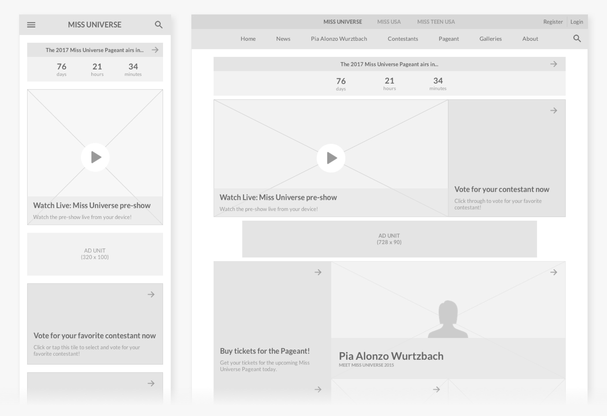
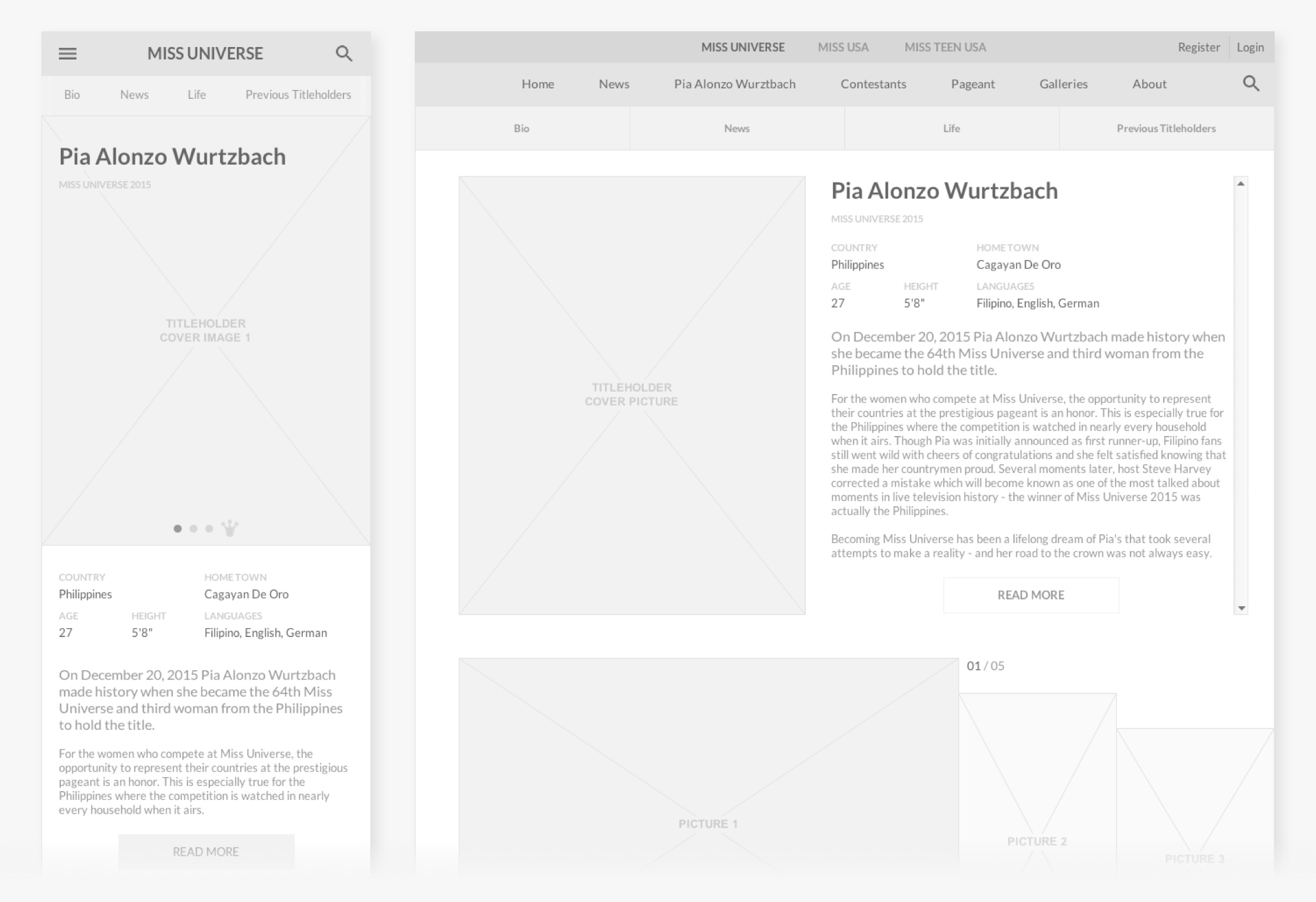
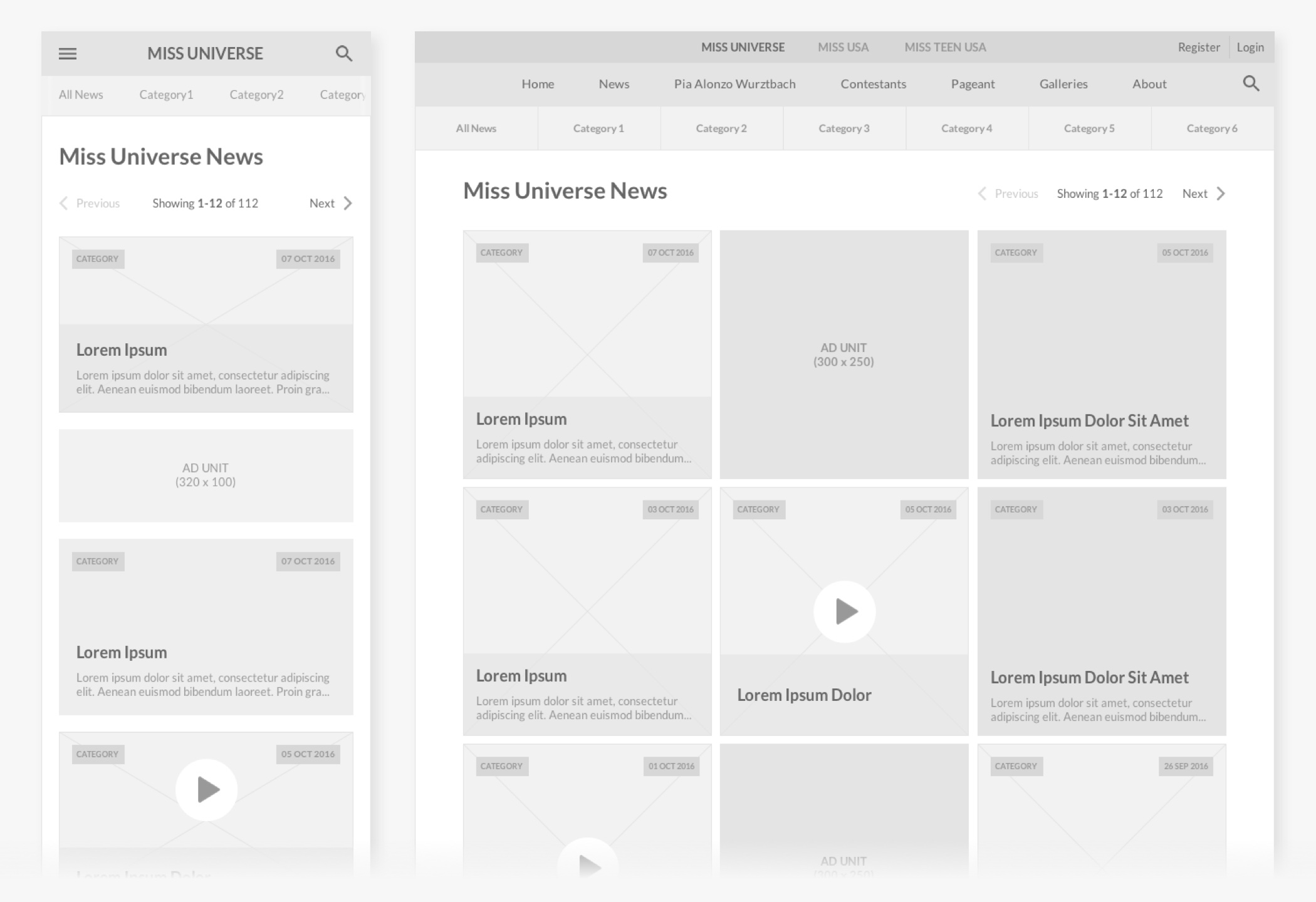
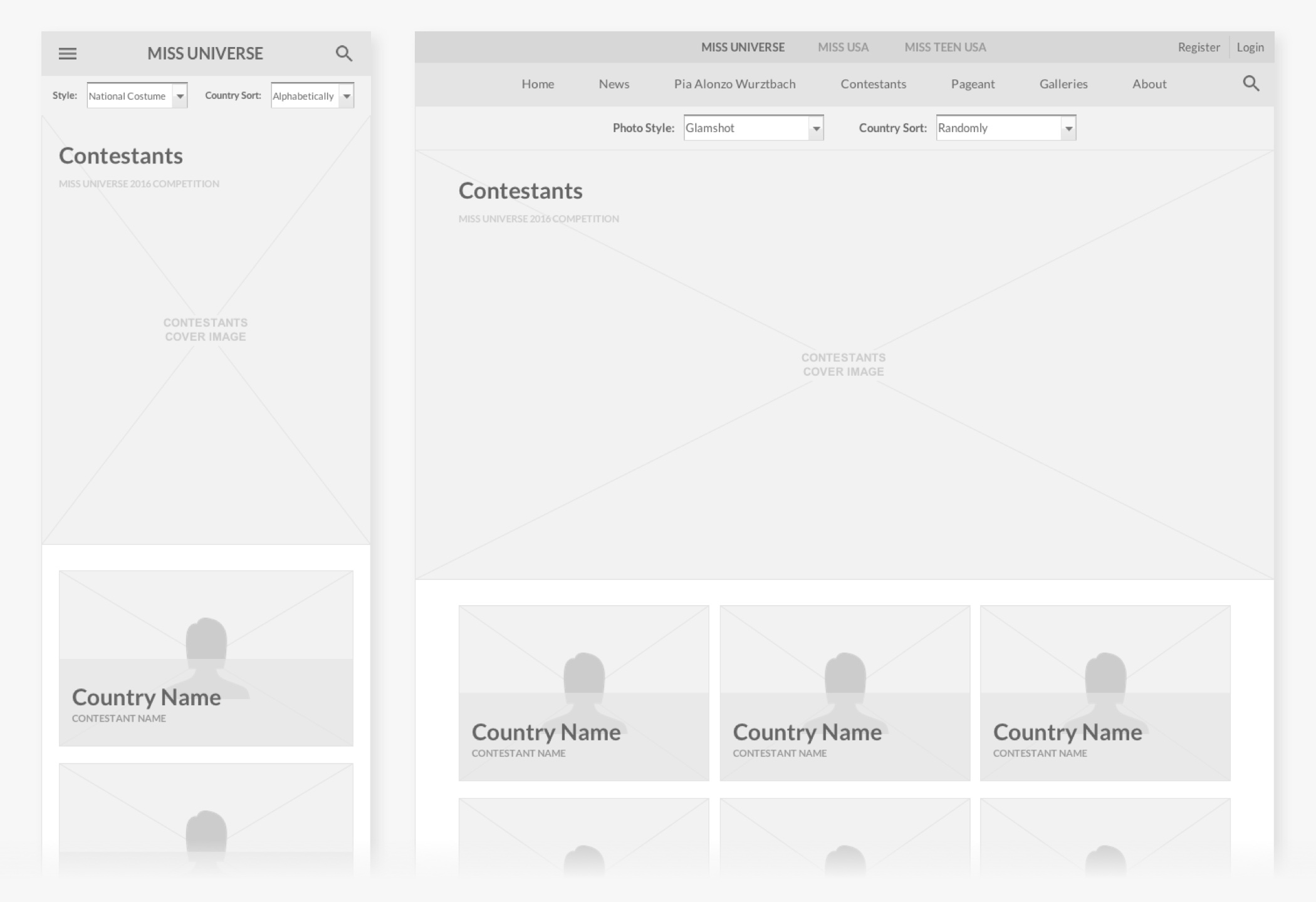
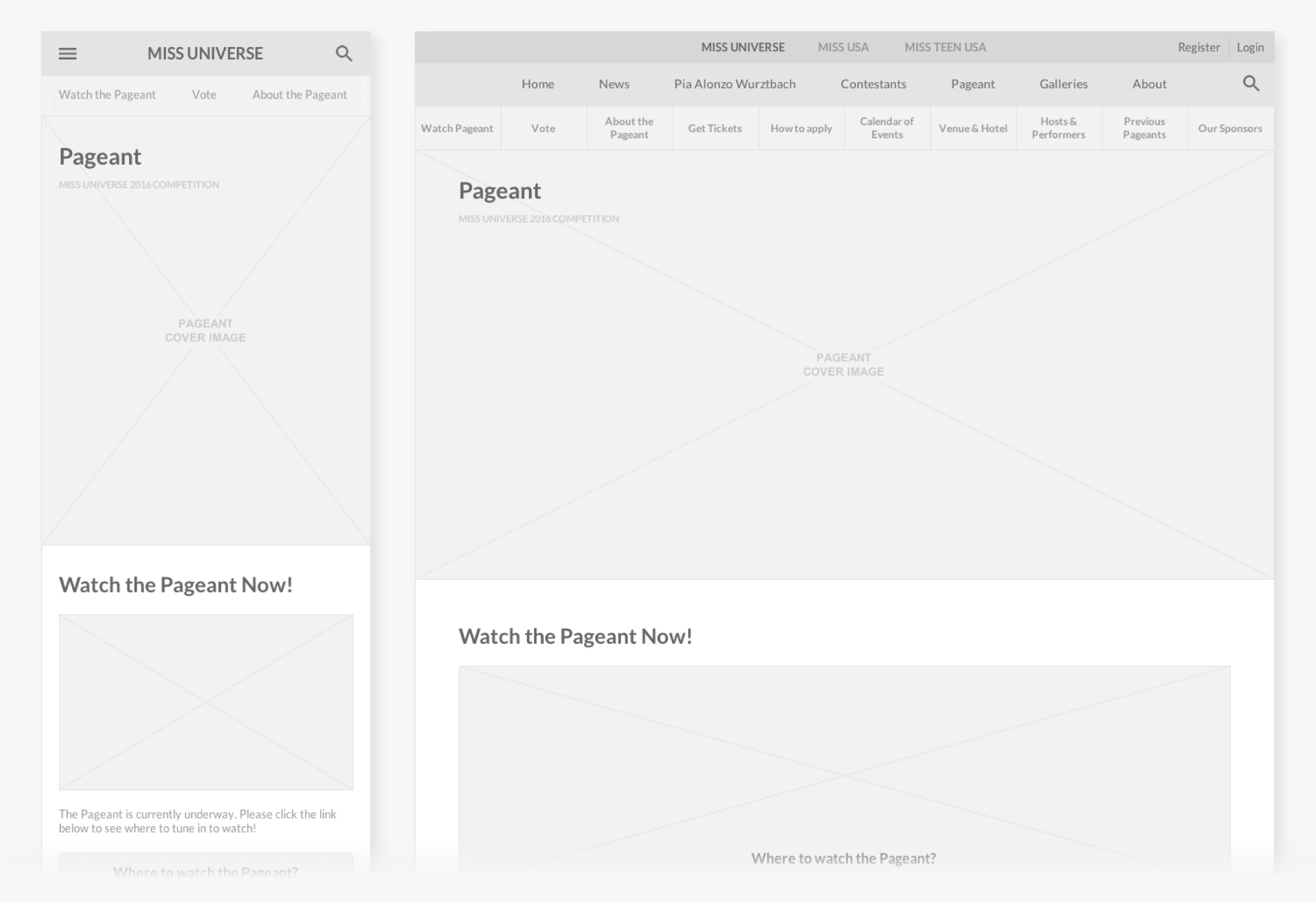
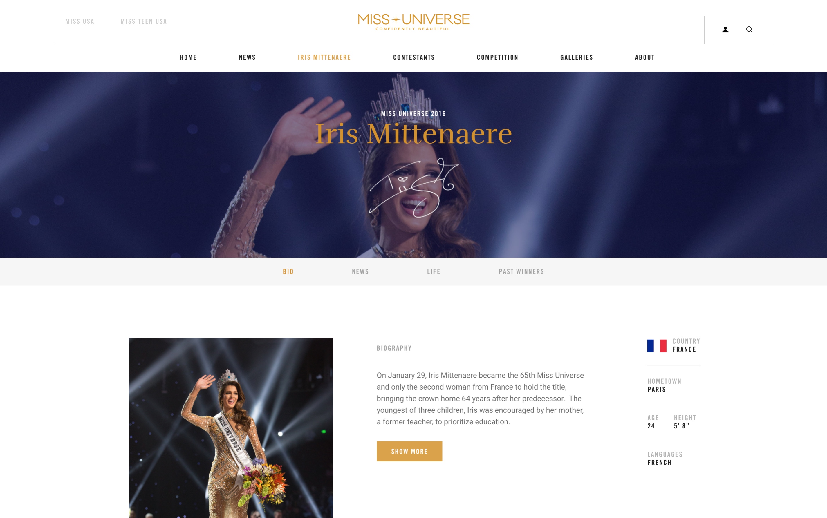
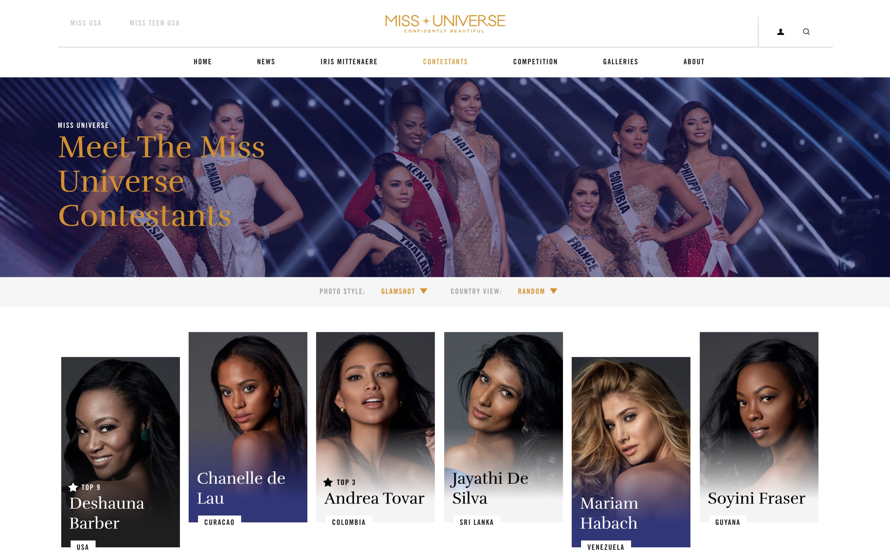
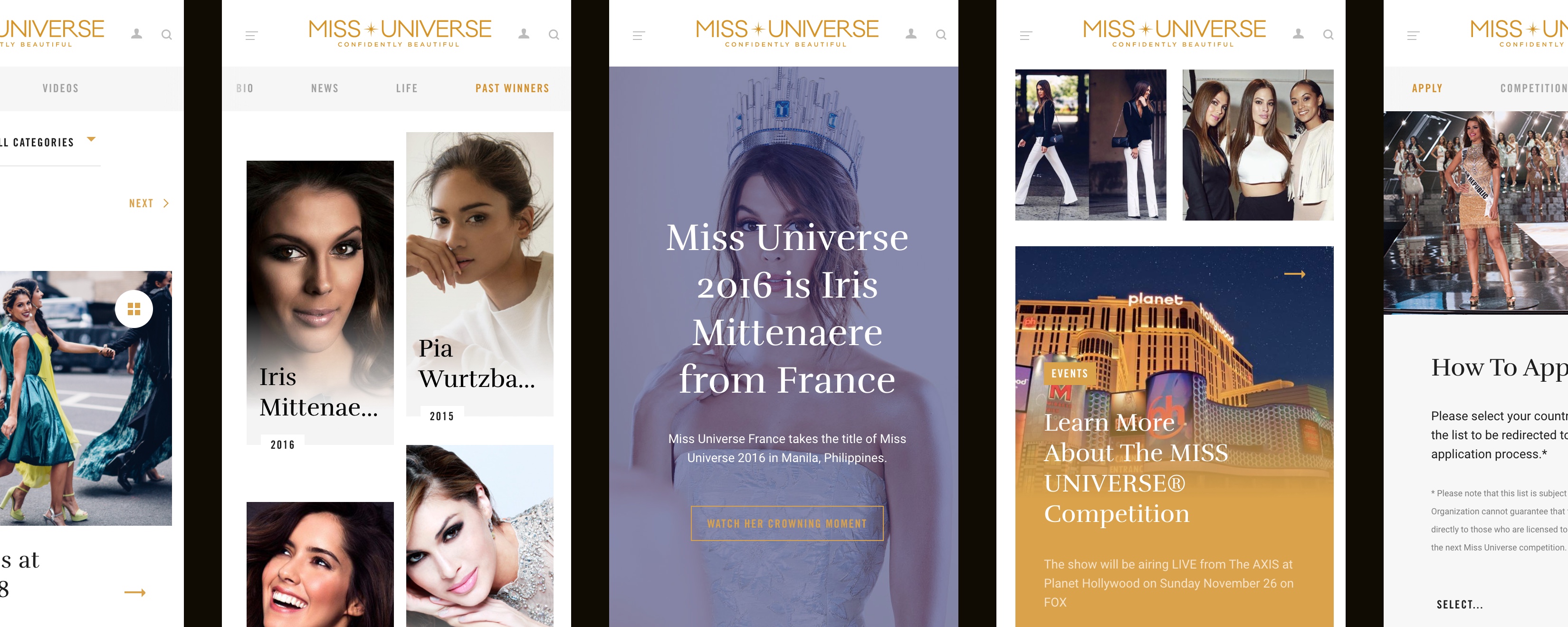
By far, the biggest chunk of work was the wireframing of the new site. With the sitemap approved, I proceeded to design interactive wireframes for every section of the site, also providing layout templates for deeper pages.
Supported by the analytics insights and overall strategy, our decision was to go for a mobile first approach. Desktop wireframes were also designed afterwards.
Art Direction & Visual Design
Discovery deck / Site map / Interactive wireframes available upon request.
Discovery deck / Site map / Interactive wireframes available upon request.